Optimizing the Computer Monitor Display
Tagged with computer monitor, display, font sizes, resolution on March 17, 2024
 When it comes to your computer monitor’s display, you’re not just concerned with the display generated by your operating system’s desktop environment. You also have to be concerned about the display generated by your web browser. The first you have some control over. The second, not so much.
The best way I can describe your options is by telling you what I’ve done to make reading easier for myself as well as others. Hopefully, desktop and web designers will take some of this to heart.
Your Computer Monitor Display and Your Desktop Environment
The 1080p, 1920×1080 pixel display is currently the most common computer monitor display. Viewing a few results generated by your favorite search engine will confirm that. My inexpensive laptop computer (less than $400 USD) has a 1080p display. Even the inexpensive portable monitor (less than $100 USD) attached to my Raspberry Pi 400 has a 1080p display.
Icons and text look fine to me on anything 19 inches and above, but the icons are small, and the text is tiny on my 15.6-inch and 14-inch computer monitors. There are three ways I can increase those sizes. The first is fractional scaling of 125 percent or more. Unfortunately, I have difficulty setting up virtual machines using any increment of fractional scaling — it makes their displays even smaller.
The second is by adjusting icon and font sizes. Font sizes can be increased immediately by selecting “large text” in accessibility options, which will make the fonts 20 percent larger. The third is by lowering the screen resolution. That actually works the best, but you lose a lot of the screen real estate gained by having a high resolution computer monitor in the first place.
I use the second way, which doesn’t help with websites using small font sizes.
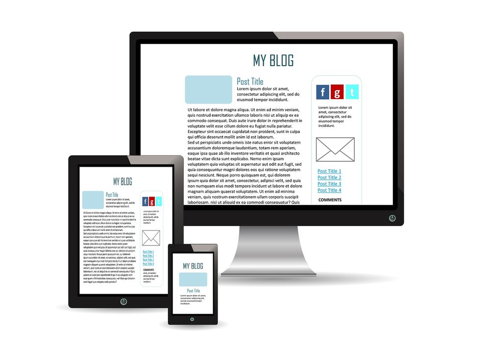
Responsive Font Sizes
While most modern websites employ some method of making font sizes match computer monitor resolutions, there are some older ones still using fixed font sizes of 17 pixels or smaller. I won’t even bother to try to read them. I may not have perfect vision, but I value what I have.
Before I started this blog, I discovered “Responsive Font Size (Optimal Text at Every Breakpoint)” by Matt Taylor. I employed his methods while designing the blog. I’ve tested the appearance at every resolution I can switch to, and it looks fine. Since I set the maximum width to 1536 pixels, only the resolutions with wider widths have extra spaces at the left and right margins.
Most of the websites I frequent have font sizes similar to mine. Like my own, I have a hard time reading them when I use my default resolution without any changes.
I recently discovered “A formula for responsive font-size” by Jim Fisher. It’s simpler than Matt’s method, but not as precise. It also seems to start off at 17 pixels for mobile instead of 16. His font sizes appear to be larger at the 1080p resolution as well.
Higher Resolution
The 4K, 3840×2160 pixel display seems like it will be the next step in computer monitor display resolution. There’s no way on Earth I’ll be able to read anything at all at that resolution. I hope the desktop and web designers figure out a way to automatically adjust the resolutions to 1080p or even lower.
4K is only great for videos, huge televisions and huge computer monitors.
← Previous ArticleNext Article →